For my final 4 manipulated images I decided to have a nursery rhyme theme of "Hey Diddle Diddle", to add an air of light heartedness and fun to my overall landscape theme of 'natural wonders". The words of the rhyme are a slight throw on the original words enabling my 4 images to be entitled:-
Hey Diddle Diddle
The Cats On A Fiddle
The Cow Jumped Over The Moon - The Little Dog Laughed To See Such Fun
And The Dish Swam Away With The Spoon.
In making the decision to manipulate in this way I had looked at the work of other photographers in my research blogs and in class, who had also given a sense of fun to their landscape backdrop settings, by the addition of objects/people/animals. It was obvious these additions had been added to their images showing their sense of humour and fun. These inspired me to try to capture something similar.
I have given my tutor (Marie) copies of all the images I used in this manipulation process on a CD:
Here are the images:-
Hey Diddle Diddle
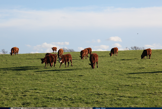
The scene before manipulation
Hey Diddle Diddle:
I placed 4 sheep in the background image of an 'entrance' image I had taken in the snow. I liked the thought of the white sheep in the white snow, matching in with the scene as though they should be there.
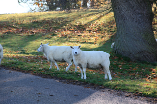
The foreground main sheep, which I took from another image, had been looking straight at me when I took the shot, as though he was going to say something....which gave me the idea that the sheep can be the Diddles. Big Diddle (this forefront main one) I took from the another image using the magnetic lasso tool (clicking on the lasso tool in the left hand tool box in photoshop, then in the sub heading, clicked magnetic), carefully going round all his edges with the mouth using this tool, then copying and pasting him onto this background (edit, copy, paste). ( I'd had to place both images in Photoshop first). He appeared on quite big in size in the background trees so I sized him down abit (edit, free transform, scale) and bought in the edges of the dotty box that appeared round him, by holding down the shift and alt keys together (resizes all) then used the move tool to place him where I wanted him to be. I was trying to place his hind legs in what looked like holes in the snow, because I hadn't got his full feet, and to make him blend in better. Once I was happy I flattened the image (layer, flatten image) and saved it as a jpeg file to carry on later at a later time.

I had taken a few images with sheep on so I decided to add my second sheep from a different image and chose a sleepy one because he had his eyes closed. I made sure the layers box was open (window, layers), opened the image with the sleepy sheep on in photoshop (by dragging the image over the photoshop icon) and then I used the pen tool this time to pen round his edges with dots, swinging as I went for the curvy parts, by keeping the mouse held down. (first I had zoomed into him, with comand +, so that I could see him bigger which was better for penning). When I came to the end of him I clicked on the first dot, this ends it and tells the computer you have finished cutting him out. Then I clicked on 'paths' in the layer box and its top right arrow within that same box, make selection, 'feather by' and changed the pixel to '1'. This makes the edges less hard in their appearance. Then edit, copy, and next I bought up the image I wanted this second sheep placed in (by dragging the image over the photoshop icon). This was the original image 'entrance' background with the first sheep installed on it, and I clicked edit and paste. Now the sleepy sheep was on and I resized him as I did the first one and moved him to where I wanted him to be, next to the tree.
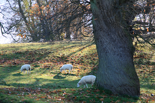
Following the above senario I chose my third sheep from a third image and pasted him onto my original also. I wanted him facing the other way so I clicked edit, flip horizontal, and this turned him around, then I resized him.
My forth sheep was a copy of the third, but I made him a different size, abit bigger to try to show perspective with the distance between him and the other one, and just to make him different. I had copied him with the clone tool and chose a brush big enough to cover him, then pressed Alt and click, moved a copy of him along abit where I wanted him to be, then released the buttons. I moved him properly with the move tool being careful about where I placed him and where the sun light was reflecting. I knew I couldn't place him in direct sunlight, if he did not have a part reflected coat. I figured where I put him would be where his coat, if it did catch the sunlight on his side, would be his side that wouldn't show to us.
Now I had the finished manipulated image I wanted, so again I flattened the image and saved it as a jpeg file.
Saving it as a 'jpeg' means I am not able to go back in and amend those same pieces I had been working on (each sheep), but if I thought that I may have wanted to do just that, and had set up the image using more layers, I could have saved it as a 'psd' file which lets you back in when amending/creating different layers.
The Cats On A Fiddle:
The Cats On A Fiddle
The scene before manipulation
I lightened the shadows of the above scene with brightness/contrast controls in photoshop prior to me carrying out the manipulations, just to give a more appealing and sunny outlook.
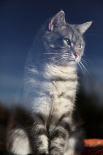
I had took a photograph of my cat Mertle and wanted to place her onto a background image of 2 huts entering Calke Abbey. My idea being that she would sit in one of the huts with a money jar beside her, and I would label the other hut with a sign which had had its original words scrubbed over, and was now reading 'Pay the cat'. I would leave some of the original writing of this sign showing slightly, on purpose, making out the cat had scrubbed it and re-written the new words, so that all entrants paid their monies to her. (ie. cat on a fiddle, being a money fiddle).
At first I was going to have the scene as just the one hut with Mertle in, cropping the other hut out (see image below) and having the sign above her, but then changed my mind to the 2 huts as the scene would have been too small and I thought it did not give enough depth. I also decided the sign would work better labelled across the second hut.
example of the cropped idea
I had also taken a photograph of a small archway opening at home with a jar containing money coins placed upon it. So first I placed Mertle inside the arch, next to the money jar, by cutting round her using the pen tool and copy and pasting her into the image of the archway (using the same methods described above). I flattened this image and saved it as a jpeg. Next I cut out the archway (now containing Mertle an the money jar) using the pen tool and copied and pasted it into the background image of the 2 huts. I played about with it somewhat, and resized until it looked like it was meant to be part of the inside of the left hut. I also clicked edit, flip horizontal to make it face the other way to the way I had taken the shot.

I had took a photograph of an entrance that had a red sign overhanging its roadway and this was the sign I used. I first opened this image in photoshop and used the eraser tool to wipe over the sign slightly so that I could still make out some letters underneath. I cut the sign out using the pen tool and copied and pasted it onto the 2 huts image, moving it accross and over the right hut and re-sizing to fit, to look like it had always been there. Then using the 'T' (type) tool I typed 'pay the cat' which appeared in the middle of the image. ( I had changed the colour of the type to red via the colour swatch). I then moved the type over the sign and when happy flattened and saved the image.
I love the tonal colours of this scene, the way Mertle now sits happy in the sun light and I think the red sign looks part of it.
The Cow Jumped Over The Moon - The Little Dog Laughed To See Such Fun:
The Cow Jumped Over The Moon-
The Little Dog Laughed To See Such Fun
The scene before manipulation
For my third image I had been out late one night to take a shot of a full moon. I knew at what time of night it was going to be behind a certain tree just down the road from where I live so at 11.50 at night I wrapped up and taking my camera and tripod with me drove to the spot. I set up and ran off a few shots and was pleased with this one. I particularly liked the way the moons reflection lit up the tip of the clouds, and the way the tree branches looked a reddish colour due to a back street light helping a hand.
I had taken a photograph of some cows when out one day (Mooving, an image I had featured previously in my blog) and decided to cut out a main cow, one that had moving legs and a white face, so that it would show up better on this dark moon image. So I cut it out using the pen tool and copied and pasted it onto the above image, resizing and moving to the above moon area. I clicked on edit, free transform, scale and distort, to move the cow at a slightly different angle, as I wanted to raise his back end to look like he was in fall slightly, as he jumped over. When I was happy with him I flattened and saved the image for later.
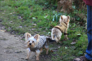
I had taken a photograph of 2 small dogs as I walked around Calke, really just because they were so small and was walking with their owner with their coats on. I remember asking the owner if I could take their photograph and he replied "yes if they'll let you!" So I set the camera and pointed it toward them quite close but they didn't like it and started to growl and turn away. I quickly took the shot, thanked the man and went on my way. From this image I chose the dog that turned away, knowing that he was at the angle I wanted for the above moon image. I liked the way his white colour would match my moon scene colour wise, with his coat adding interest. Cutting him out with the pen tool again, I inserted him by copy and paste and moved him into the forefront branches of the tree. I felt pleased that the light on him already seem to match my image, looking like the moon reflection had given him this light. All that was left was to type on the words with the 'T' (type) tool: Ha Ha which I placed at a slopping angle coming from his mouth, via 'warp text' (like I had previously used on my 'Blue Sheep' image in a previous blog). I then flattened and saved the image.
And The Dish Swam Away With The Spoon:
And The Dish Swam Away With The Spoon
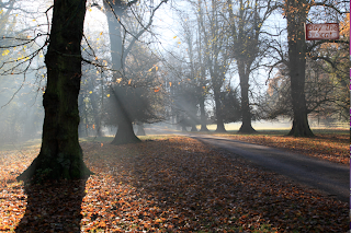
The scene before manipulation
I decided to use one of my 'Reflections' images as the background, one where I had taken a photograph of a lake with rippled water (prior activity by a bird or duck). I thought the ripples would be good to place to insert the bowl and spoon, looking like there had been some movement by it swimming away. The above scene before manipulation also had some darkness in the shadows which I lightened the contrast/brightness controls in photoshop.

I took a few photographs of a green bowl and a wooden spoon at home, and chose the best one, light wise to cut out the items to use on the above background scene. I chose these with thought of how their colours were natural to match into this scene, and keeping in context with my overall 'natural' theme. I thought about the light and how the light caught on them (from daylight light from the kitchen window at a certain time of day, would match in with the light of the background image above). I cut out the bowl and spoon using the pen tool in photoshop and separately copied and pasted them onto the above background. When cutting out the bowl I cut into it, half its depth, because it was quite a deep bowl and I didn't want it to look just placed high onto of the water. I thought if it has less depth I may be able to make it appear that some of it was underneath. I resized them and moved them into near on centre of the water, amidst the ripples. I played about with the bowl until I was happy, then placing the spoon handle up, (using edit, scale, distort slightly) I positioned it inside the bowl. I zoomed into them now (command +) to see close how they sat on the water, and when happy, flattened and saved the image.
All the above manipulation was carried out by placing each image into Photoshop and using the relevant tools therein to carry out the adjustments, ie. cut outs, copy and paste, crop and resizing, brightness/contrast\lightness to backgrounds.
I really enjoyed working on these images. Completed they are fun and make me smile. Marie (my tutor) has a copy of these final 4 manipulated images, together with all the images I used to manipulate them, on a CD.
Equipment Used:
Canon EOS 5D Mark II camera with battery
24-105mm L lens
SanDisk Extreme CompactFlash card 8GB
Tripod
Mac Computer for manipulation in Photoshop


